
A visitor lands on your site, scrolls for a few seconds, then closes the tab without reaching your contact form. It’s a frustrating outcome, especially when you know your business can help the people who are visiting.
Often, the problem comes down to small details on your website that create hesitation. A slow load time, unclear messaging, buried contact details, or missing reviews can all stop visitors from taking the next step.
Fortunately, you don’t always need a complete rebuild to improve results. This guide covers the features that encourage enquiries, the mistakes that push visitors away, and how to spot what your site might be missing.
Let’s get into it.
Why Visitors Leave Without Getting in Touch
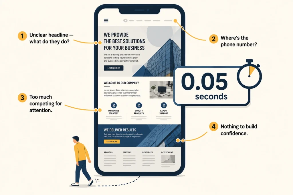
Visitors leave because something on the page makes them hesitate, and hesitation almost always turns into an exit. Maybe the headline isn’t clear enough, the layout makes it hard to know where to look, or there’s no social proof in sight. These are the kinds of details that push visitors out the door before they ever think about getting in touch.
The problem is that site owners often don’t notice these issues until they check their analytics and realise almost nobody is getting in touch. That isn’t surprising when you consider how quickly visitors form opinions.
In fact, research from Carleton University found that first impressions form in just 50 milliseconds, well before a visitor has read a word. Those early impressions often come down to the small details of how your website works.
Website Features That Drive Enquiries
After auditing hundreds of websites, we’ve found that the same features consistently separate sites that generate enquiries from those that don’t. Each one helps remove a barrier that might otherwise stop a visitor from getting in touch. Here’s what to look for on your own site.
A Clear Value Proposition
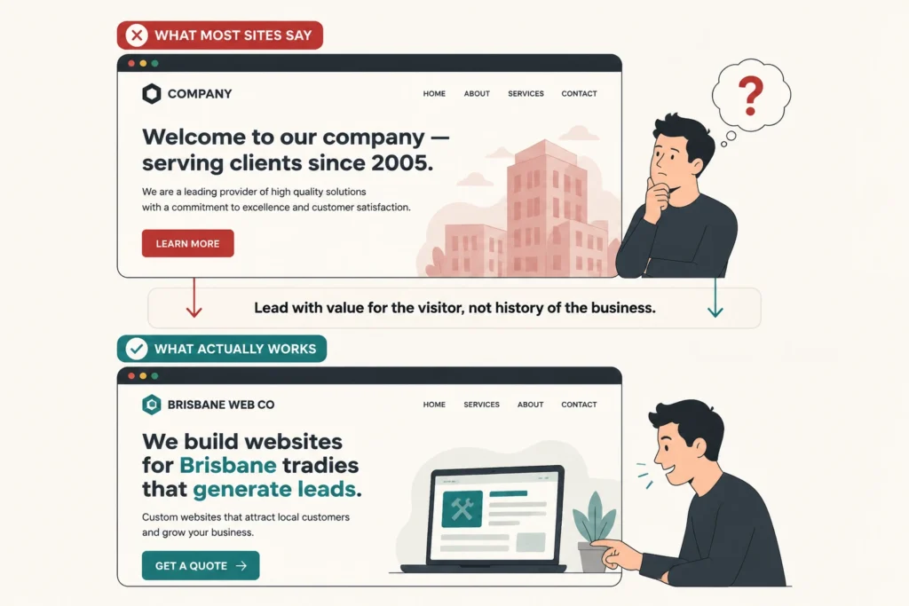
A value proposition is one of the most important website features you can get right. It’s the first thing a visitor reads, so it needs to quickly explain what you do, who you help, and why they should choose you. If that message isn’t clear within a few seconds, most visitors won’t stick around to work it out.
Even so, a lot of website content gets this wrong by focusing on the business rather than the visitor. For example, a statement like “welcome to our company, we’ve been serving clients since 2005” tells your target audience nothing useful. Compare that to “we build websites for Brisbane tradies that generate leads,” and the difference is clear.
Easy-to-Find Contact Options
A hidden phone number costs you enquiries just as easily as a broken one. If visitors have to hunt through your footer or click through multiple pages to find a way to reach you, most won’t bother.
And even if they decide to get in touch, not everyone wants to do it the same way. Some people want to call, others prefer a form, and plenty would rather send a message outside business hours. Make sure these options have strategic placement across your service pages and in your header. That way, reaching you never feels like extra work.
Trust Signals
Before anyone calls you, they want proof you’re worth calling. That’s what trust signals are for. Reviews, testimonials, certifications, and high-quality images of your team answer the unspoken question: “Can I rely on this business?”
When a potential customer sees “4.9 stars across 70 Google reviews,” reaching out feels like a safer decision. The same applies to photos of real work and a named team. They show there are actual people behind the business, which can give hesitant visitors the confidence to pick up the phone.
Speed and Mobile Performance
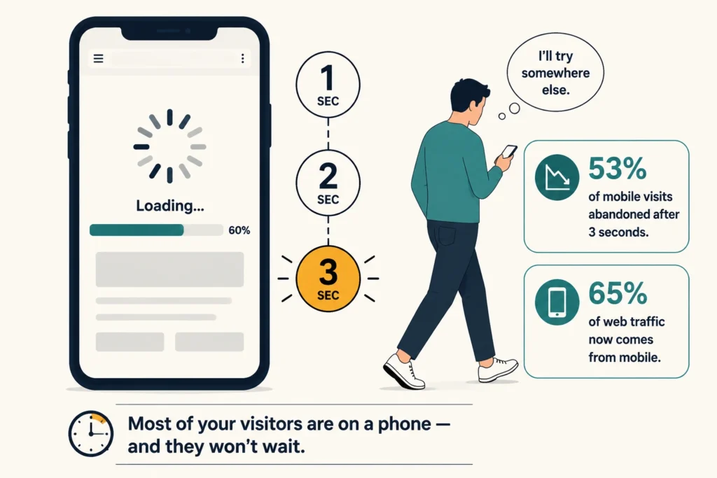
65% of all web traffic now comes from mobile devices, which means the majority of your visitors are likely reading your site on a phone. If your site is difficult to use on a phone, potential customers may leave before they ever reach your enquiry form or contact details.
Speed plays a similar role. The slower your site, the faster visitors leave. In fact, 53% of mobile visits are abandoned if a page takes longer than three seconds to load. That’s why you should always build your site with mobile optimisation in mind.
Clear Calls to Action
Vague buttons like “Submit” or “Learn More” leave visitors confuse what happens next, and that uncertainty often ends with them leaving your site. Every page should have one clear primary call to action that’s easy to spot without scrolling.
Take a service page, for example. A button like “Get Your Free Quote” tells visitors exactly what they’ll receive after clicking. And when people know what to expect, they’re far more likely to click. Getting this right is one of the lowest-effort ways to improve your conversion rate without changing anything else on the page.
Simple, Low-Friction Forms
A contact form is often the last step between a visitor and an enquiry, so the simpler it is, the more people will actually send it. Research also supports this. A Marketo case study found that reducing form fields from nine to five lifted conversions from 10% to 13%.
For most service businesses, asking for a name, email address, and a brief description of what the visitor needs is enough to start the conversation.
The goal is to make getting in touch feel quick and effortless. Once someone reaches out, you can gather more details during the follow-up.
Mistakes That Cost You Enquiries
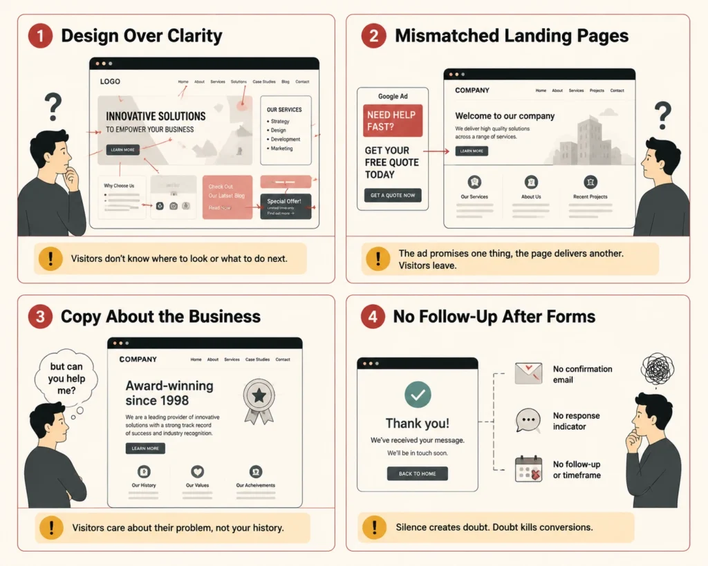
You could tick off every feature above and still lose enquiries if one small mistake undoes the rest. These four show up again and again, even on sites that otherwise look polished:
- Design Over Clarity: As we already mentioned, visitors form an impression of your business quickly. If your layout pulls attention away from your core offer, they may leave before understanding what you do. To avoid this, keep the design clean and make sure the most important information is the first thing they see.
- Mismatched Landing Pages: A generic homepage can waste ad spend because it rarely matches the specific message visitors clicked on. A dedicated landing page solves this by keeping the experience focused and giving visitors a clearer next step.
- Copy That Talks About the Business: When someone visits your site, they want to know whether you can help them. So lead with the value you offer, then use your history, values, and awards to support your credibility rather than introduce it.
- No Follow-Up After Form Submissions: Once someone submits your contact form, the experience shouldn’t end in silence. An automated confirmation email reassures visitors that their enquiry has been received and leaves them with a more positive impression of your business.
From our experience, addressing even two or three of them can increase conversions and improve the experience for everyone who lands on your site. If you’re not sure where to start, your website analytics will usually point you in the right direction.
Your 10-Minute Website Conversion Check
Grab your phone and open your website as if you were a first-time visitor. Can you tell what you do within five seconds? Then see how many times you need to scroll before finding a clear way to get in touch.
Next, work through the features covered above: value proposition, contact options, trust signals, page speed, calls to action, and contact forms. Most websites are only missing one or two of these, so you’re probably closer to improving your enquiry rate than you think.
If you’re not sure where your website is losing enquiries, BasicLinux can help. Our team offers website reviews that pinpoint the gaps and give you a clear list of improvements to act on.
Get in touch for a free consultation.
Frequently Asked Questions
If you’re still weighing up the details, these are some of the questions we get asked most often when working with businesses on their website conversions.
What is lead generation and how does a website support it?
Lead generation is the process of turning website visitors into people who express interest in your business. A well-structured website supports this by guiding visitors toward a desired action, whether that’s filling out a form or making a call. The features covered in this article all contribute to increasing the leads generated from your existing traffic.
What are free templates and should I use one for my website?
Free templates are pre-built website designs you can apply without starting from scratch. They work for some businesses, but they’re rarely built with your specific conversion goals in mind. A custom design gives you more control over user experience and how your site guides visitors toward getting in touch.
What is conversion rate optimisation?
Conversion rate optimisation (CRO) is the process of improving your website so more visitors become customers or leads. Instead of focusing solely on attracting more traffic, it focuses on turning more of your existing visitors into enquiries, sales, or bookings.