You’ve done everything right. Your site looks professional, traffic is coming in, and your content is solid. But conversions still aren’t happening the way you expected.
The problem isn’t effort or intent. Sometimes, small, overlooked features like confusing form fields or missing trust cues can block conversions without being obvious.
It doesn’t mean you need a full redesign or more traffic. All you need are practical fixes that remove friction where it matters, and that’s exactly what we’ll cover in this article. We’ll explain the most overlooked website features that can quickly improve conversions.
Let’s start with the basics.
What Conversion Optimisation Really Means for Your Site

Conversion optimisation means improving how many visitors complete actions on your site, from purchasing to signing up for your services. The goal here is to convert more of your existing traffic without spending extra money.
Bringing in more traffic costs money, but getting more of your existing visitors to convert doesn’t. When you analyse user behaviour, you can see exactly where people get stuck in your sales funnel and why they leave. It could be slow landing pages, forms that ask too many questions, or unclear calls to action that confuse potential customers.
Thankfully, even small adjustments can make an impact. For example, testing a better headline, a clearer button, or a shorter form often improves conversion rates faster than expensive redesigns. These simple improvements guide users to take action and can increase sales without breaking the bank.
Live Chat Tools That Actually Get Responses
Live chat is where your potential customers can ask questions the moment they need answers. That immediate connection stops them from leaving and makes a strong first impression. To get the most from chat tools, focus on finding out two things: why visitors prefer instant answers and how to set chat up without getting in the way.
Why Website Visitors Prefer Instant Answers
The average viewer’s attention span online is now just 8.25 seconds, which means you have a very small window to capture interest. Live chat helps by giving visitors a fast, low-effort way to get answers. With one click, they can reach you, and chat feels far less confronting than a phone call for people still in the early decision-making stages.
From working with Brisbane businesses, we’ve seen how response time directly affects whether potential customers stick around or move on. Quick replies build trust far faster than waiting days for an email response.
Setting Up Chat Without Annoying Visitors

Have you ever landed on a site and a chat widget immediately started asking questions? Chances are, you didn’t stick around to answer them.
That’s exactly why chat widgets should appear after visitors spend some time browsing, not the second they land. Similarly, you should also customise your greeting messages to match the specific page the visitor is viewing.
For example, the chat on your pricing page should ask “Need help choosing the right package?” instead of a generic “How can we help?” Easy exit options let people dismiss chat windows without feeling trapped in the sales funnel.
Trust Signals: The Overlooked Conversion Helpers
Think about what you do before buying something online. You check reviews, right? Your visitors do the same thing when they land on your site.
Trust signals are proof points that show your business is legitimate and reliable. They reduce hesitation and give people the confidence to move forward in your sales funnel.
The most effective trust signals include:
- Customer Reviews and Testimonials: When you display reviews and testimonials, it shows potential customers that real people get real results from your product or service. Video testimonials work even better because they let happy customers explain their experience in their own words.
- Security Badges and SSL Certificates: People trust secure sites. Features like padlock icons in the browser or trust seals from companies like Norton or McAfee reassure visitors that their payment information stays protected during checkout.
- Industry Certifications and Local Business Memberships: If you have certifications or memberships related to your industry, customers see you as more trustworthy and professional. This type of social proof works especially well for service businesses where expertise is important.
Place these throughout your site, particularly near conversion points like contact forms, pricing pages, and checkout buttons. Even two or three well-placed trust signals can reduce buyer hesitation.
Exit-Intent Popups Done Right

Exit-intent popups give you one last opportunity to engage visitors who are already on their way out, which effectively turns abandoned sessions into captured leads. They work by tracking cursor movement and detecting when someone is about to close the tab or navigate away.
It’s the value you offer at that moment. That’s why the most effective exit-intent popups match the offer to what the visitor was viewing. If someone is reading about your services, a free consultation makes sense. If they’re browsing products, however, a first-time buyer discount is far more relevant.
You can also use limited-time offers in exit popups. When visitors see a time-sensitive incentive, it gives them a reason to pause and reconsider leaving. Just make sure the urgency is genuine. Countdown timers that reset on every visit tend to damage trust more than they improve conversions. The goal is to make one final, honest attempt to address whatever caused the visitor to hesitate.
How Page Speed Affects Your Conversion Rates
Page speed directly impacts whether visitors stay long enough to explore your product or service. In fact, Google research shows bounce probability jumps 32% when load time increases from one to three seconds. That’s a massive loss in potential conversions before users even interact with your site.
So where exactly do things go wrong, and what can you do about it? Let’s take a look.
Where Bounce Rates Start Climbing
Blank screens and shifting layouts create uncertainty. While your page is still loading, visitors can’t see your value proposition, which makes it easier to leave than wait.
The problem is even worse on mobile devices. Mobile users often browse on the go or multitask, so they tend to abandon slow pages faster than desktop users.
Quick Fixes You Can Implement
High-resolution images are one of the most common causes of slow websites. Compressing those images is one of the easiest fixes. Tools like TinyPNG or built-in WordPress plugins reduce file sizes without noticeably affecting quality, which improves load times without changing how the site looks.
It’s also worth auditing your plugins and scripts. Each adds extra requests that slow page loads, so remove anything you don’t truly need. Content Delivery Networks (CDNs) help as well by serving files from servers closer to your visitors, and many hosting providers include CDN access by default.
Simplifying Your Sales Funnel With Better Forms
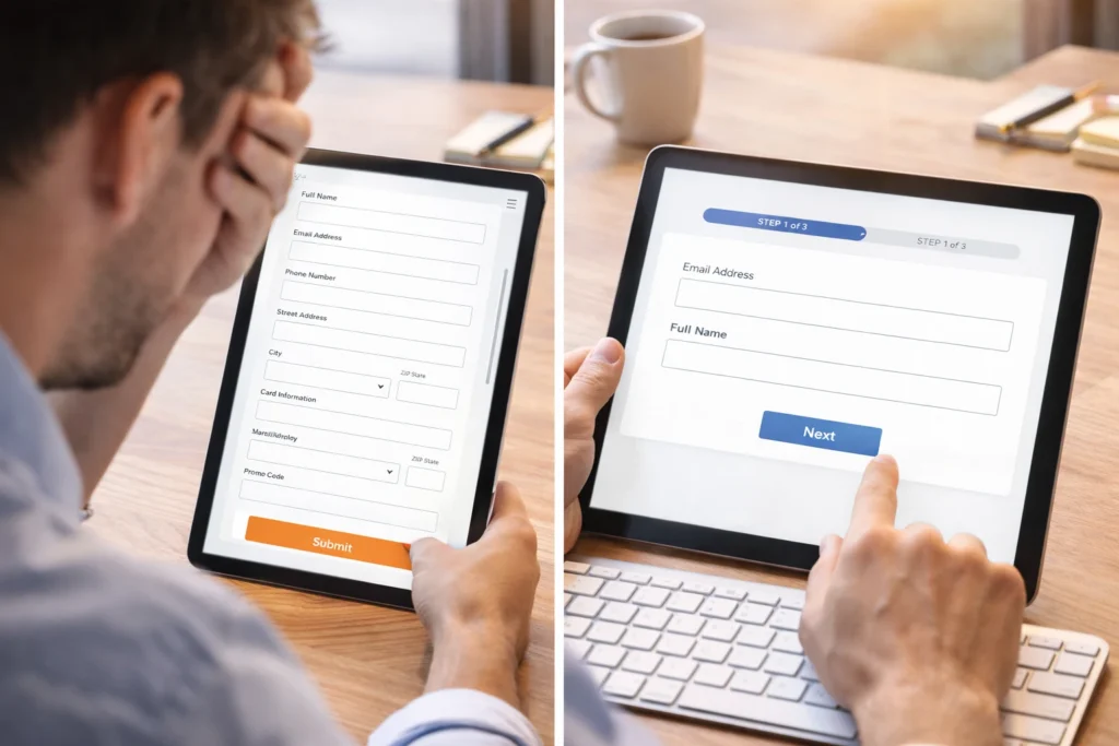
Simpler forms are one of the fastest ways to increase conversions (because nobody wants to fill out their life story just to get a quote). Each extra field you ask for creates another opportunity for someone to abandon the process.
The numbers back this up. Marketo tested forms with five, seven, and nine fields. The short form with only five fields produced an average conversion of 13.4 percent compared to seven’s 12 percent and nine’s 10%. That’s a noticeable difference just from removing a few questions.
Of course, shorter isn’t always better. You still need to collect essential information without confusing visitors or leaving gaps in your sales process.
This is where multi-step forms come in handy. Breaking longer forms into smaller sections makes the process feel more manageable. Instead of showing someone 15 fields at once, you show them three or four per page. This keeps people moving forward without feeling overwhelmed.
Smart autofill features speed things up even more by remembering details users entered previously, reducing the effort needed to complete the form.
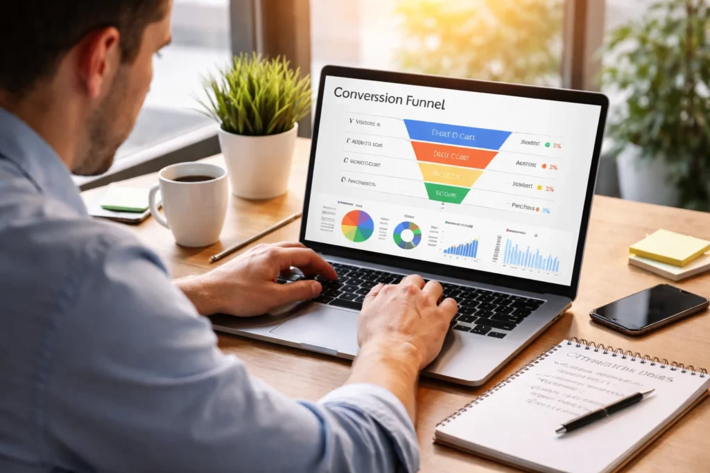
Analytics Tools That Show What’s Actually Working
How do you know which parts of your site help conversions and which parts drive visitors away? Analytics tools reveal exactly that. They show where visitors get stuck, what they click, and where they leave. This way, you can see what’s working instead of relying on guesswork.
Here are three types of tools that do this best:
- Heatmap Tools: Tools like Hotjar or Crazy Egg use colour coding where red areas indicate high activity and blue areas show spots people ignore. This helps you place important elements where people actually pay attention on your landing pages.
- Session Recordings: Want to know how visitors navigate your site? You can use FullStory to capture the complete journey real users take before converting. Watch recordings to spot hesitation points, confusing navigation, and drop-off points in your conversion funnel.
- A/B Testing: A quick way to find what works is to test two versions of the same page. You might test different headlines, button colours, or layouts to see what your target audience responds to best. The data from A/B tests helps you make decisions based on actual results rather than assumptions.
Once you start tracking user behaviour through analytics tools, you can make changes based on what actually happens instead of what you think might work.
Mobile-First Design for More Conversions

Mobile devices account for 62% of global website traffic. That means if your site doesn’t work properly on mobile, you’re losing more than half your potential customers.
That’s why mobile-first design is so important. A responsive layout ensures that your site adapts automatically to different screen sizes without breaking your conversion funnel. Images resize, content flows properly, and buttons remain tappable whether someone visits on a phone, tablet, or desktop.
Beyond layout, touch-friendly design is essential. Buttons that are fine for a mouse become frustrating on a touchscreen, and tiny links or complex navigation slow people down. A clean website structure with thumb-friendly targets and simple navigation lets visitors find what they need without pinching, zooming, or struggling.
When mobile design works well, users move through your sales funnel smoothly. They can tap buttons easily, read content without squinting, and complete forms without frustration. These small improvements directly impact conversion rates because they remove the friction that drives mobile visitors away.
Start Testing These Features Today
You don’t need to overhaul your entire website to see better conversion rates. Small, focused improvements to overlooked features often produce the biggest results.
Start with one or two changes from this list. Add trust signals to your checkout page. Speed up your load times. Simplify a form that’s losing visitors. Test each change and track what happens to your conversions.
If you need help implementing these features or want expert guidance on optimising your site for conversions, BasicLinux can help. We specialise in building websites designed to improve user experience and drive results. Get in touch to discuss how we can improve your conversion rates.